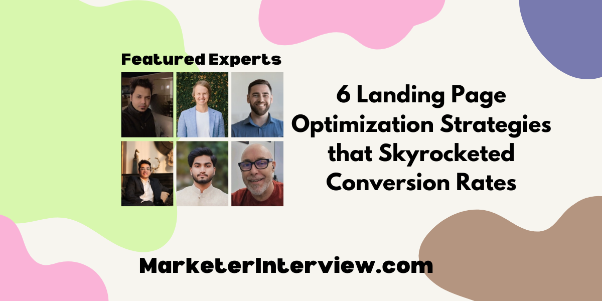
6 Landing Page Optimization Strategies that Skyrocketed Conversion Rates
In the quest for the holy grail of high conversion rates, we’ve gathered six proven strategies from top marketing professionals, including Directors and Heads of Marketing. They share specific tactics ranging from employing psychological pricing strategies to enhancing headline and CTA button visibility, which have significantly moved the needle on their landing pages’ performance.
Want to get quoted in MarketerInterview.com content just like this? Apply to become a contributor today!
Contents
Employ Psychological Pricing Strategies
Crafting a landing page that not only attracts but also converts requires a deep understanding of both the science and art of user experience and design. Through trial, error, and relentless testing, we’ve uncovered strategies that significantly boost conversion rates. Here is one distinct tactic we’ve employed, bringing its own set of surprises and successes:
On one occasion, we applied psychological pricing strategies to the layout of the pricing page accessed via the main landing page. Instead of listing prices in a traditional format, we employed charm pricing and visually contrasted the most popular package to make it stand out.
Additionally, we introduced a decoy price option, making the desired package appear even more valuable. The subtle yet powerful influence of these psychological pricing techniques led to an increase in conversions for the highlighted package, demonstrating how minor tweaks in presentation can have a major impact on decision-making.

Marc Bishop, Director, Wytlabs
Simplify Page Layout for Clarity
Sure, I can share a strategy that worked well for one of our clients. We focused on simplifying the page layout and reducing distractions. We removed unnecessary fields from the sign-up form, kept only essential information, and used directional cues like arrows to guide visitors’ attention.
We placed the CTA button above the fold and saw a 30% lift in conversions within a month. It’s all about understanding user behavior and optimizing for clarity and ease of use.

Casey Jones, Founder and Head of Marketing, CJ&CO
Test Headline Variations for Impact
There was one thing that I did to ensure that the client’s landing page reached its maximum potential: I tested several heading variations in the context of an A/B test. The tested hypothesis predicts the visitor’s interest and propensity to proceed in reading with a more powerful and value-added statement line.
Upon completion of the analysis, the button was varied in such a way that it made the message more unique and increased the conversion rate by 25%. This great boost in CTR, which led to more than 30% of leads coming from the landing page in the month after implementation alone, was measured, and it is the business outcome that we all wanted and the initial KPI that inspired the whole journey.
In the process of revising and testing each component of our landing page, we have been bringing a better user experience and proving that our campaign has a positive result for our client’s marketing.

Kartik Ahuja, Digital Marketer, kartikahuja.com
Minimize Form Fields and Add Testimonials
To optimize our landing page, we implemented a strategy focusing on simplifying the user journey. By reducing the number of required fields in our contact form from ten to four critical ones, we aimed to minimize friction.
This change, coupled with the addition of customer testimonials for social proof, resulted in a remarkable 30% increase in our conversion rate. This outcome underscored the importance of ease and trust in driving conversions.

Alex Taylor, Head of Marketing, CrownTV
Refine Strategy Through A/B Testing
A/B testing is a specific strategy I’ve used to optimize a landing page to increase conversions. Often, brands forget that what they think will work doesn’t matter. What works for the average customer is important. A/B testing involves creating two versions of a product with only one difference. This difference can be anything, from a headline to a CTA. By directing traffic randomly to both pages, you learn which version performs better.
Based on the performances, you can choose the better version. We conduct A/B testing for as many components as possible. This approach regularly refines our strategy. It helps us make data-driven decisions instead of intuitive choices and increases our engagement and conversion rates.

Faizan Khan, Public Relations and Content Marketing Specialist, Ubuy Australia
Enhance Headline and CTA Button Visibility
Certainly. We optimized a landing page by implementing A/B testing, focusing on headline clarity and the call-to-action (CTA) button.
The original page had a generic headline and a low-contrast CTA button. For the test, we changed the headline to directly address the visitor’s pain point, highlighting the convenience and speed of booking a private jet.
We also made the CTA button more prominent with a bold color and actionable text. This strategy led to a 30% increase in conversion rates, proving that clear messaging and a standout CTA are key to engaging potential clients and driving action.

Fahd Khan, Director of Marketing and Technology, JetLevel Aviation
Want to get quoted in MarketerInterview.com content just like this? Apply to become a contributor today!
