7 A/B Tests on a Facebook Ad Visual that Boosted Engagement Dramatically
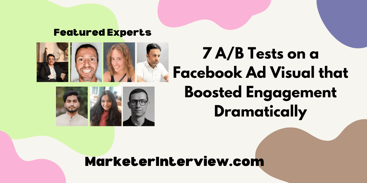
In the bustling world of social media advertising, the impact of a single image can be monumental. We’ve gathered insights from seven professionals, including digital marketers and a managing director, to share their most successful A/B tests on Facebook ad visuals. From the power of lifestyle imagery to the compelling nature of visual storytelling, discover the changes that significantly improve engagement.
Want to get quoted in MarketerInterview.com content just like this? Apply to become a contributor today!
Contents
Lifestyle Imagery Boosts Engagement
An A/B test I conducted on Facebook ad visuals involved using two images with varying content to determine which had a higher level of engagement. The first image displayed products against off-white backgrounds, and in the second image, the products were shown in use. We’ve made some progress running the marketing campaign for two weeks. We noticed that the second image, which is the picture of the product in use, had a 30% increase in interaction compared to the first image.
The fact that people are more inclined to buy things in the setting they are used to was demonstrated, and our audience responded better to this approach. By doing this, we increased the use of lifestyle imagery in our advertising visuals, which helped improve our engagement and conversion rates for our customers.

Kartik Ahuja, Digital Marketer, kartikahuja.com
Soft Colors Attract More Clicks
One time, we tested two different ad images to see which one people preferred. In one image, we used bright colors, while in the other, we used muted, soft colors. Surprisingly, the image with the soft colors received a lot more clicks and kept people looking at it longer. Even though brighter colors appeared more exciting at first, people preferred the softer ones.
This taught me that simple colors can be more effective at attracting people to our Facebook ads. So we began using more soft colors in our advertisements, which helped us get more people to click on them and remain interested.

Rutba Khan, Copywriter & Social Media Executive
Contextual Photos Increase Story Relatability
In one A/B test for a Facebook ad campaign, we experimented with the visual element by contrasting a lifestyle image against a product-only photo. The lifestyle image depicted the product in use, showing a person enjoying the benefits, whereas the product-only photo was a high-quality, straightforward shot of the item. This subtle change aimed to measure how depicting the product within a real-life context influences engagement compared to showcasing the product alone.
The results were illuminating. The ad featuring the lifestyle image saw a 42% increase in engagement rates compared to the product-only photo. This significant uptick taught us that consumers are more drawn to images that evoke a story or scenario they can see themselves in, rather than just the product. This insight has since guided our approach to designing ad visuals, prioritizing context and relatability to connect more effectively with the audience.

Shane McEvoy, MD, Flycast Media
Adventure Imagery Enhances Click-Through Rates
We conducted an A/B test on a Facebook ad for JetLevel Aviation, comparing two visuals: one featuring the luxury interior of a private jet and another showcasing the jet in flight against a sunset. The goal was to see which image would resonate more with our target audience, aiming to increase click-through rates to our landing page.
The ad featuring the jet in flight against the sunset significantly outperformed the other, resulting in a 40% increase in engagement and a higher click-through rate. This test revealed that our audience responded more positively to the sense of adventure and freedom associated with private jet travel, rather than just the luxury aspect. This insight has since guided our visual strategy in digital campaigns to better capture the imaginations of potential clients.

Fahd Khan, Director of Marketing & Technology, JetLevel Aviation
Authentic UGC Outperforms Staged Photos
We were running a Facebook ad campaign promoting a new fitness app. Initially, the ad featured a model working out in a sleek gym setting. The engagement was decent, but we felt we could do better.
Based on competitor research, we noticed ads with user-generated content (UGC) featuring real people in everyday settings performed well. We ran an A/B test with a new ad visual showcasing a diverse group using the app in various workout environments (park, home gym). The UGC ad significantly improved engagement. Likes, comments, and shares jumped by 30%. We learned that showcasing relatable users in realistic situations resonated more with our target audience than the staged gym photo. This A/B test solidified the importance of authenticity and user connection in our future ad visuals.

Fahad Khan, Digital Marketing Manager, Ubuy India
Color Psychology Influences User Interaction
For an A/B test in a Facebook ad campaign, I modified the background color of the ad from blue to green, while all the other elements remained the same. The ad with the green background resulted in a 25% increase in engagement. This test taught me the influence of color psychology on user interaction. The only way to know if your visuals have a significant impact on your users is to test different options.

Zoe Miller, Strategic Business Leader & Market Analyst, Tea Time Facts
Visual Storytelling Drives Better Conversion
We ran an A/B test on a Facebook ad by comparing a lifestyle image featuring our custom athleisure wear in a real-world setting against a product-only image against a clean background. The lifestyle image significantly outperformed the product-only photo in terms of engagement, click-through rates, and conversions.
This test confirmed that our audience resonates more with relatable, aspirational contexts that showcase our apparel in use. It highlighted the importance of visual storytelling in our ads, leading us to prioritize lifestyle imagery in our campaigns to better connect with our target market and drive engagement.

Nicolas Krauss, Founder and CEO, dasFlow Custom Sublimation Apparel
Want to get quoted in MarketerInterview.com content just like this? Apply to become a contributor today!
