6 Ways to Use Heatmaps to Improve Landing Page Layouts for Luxury Travel Sites
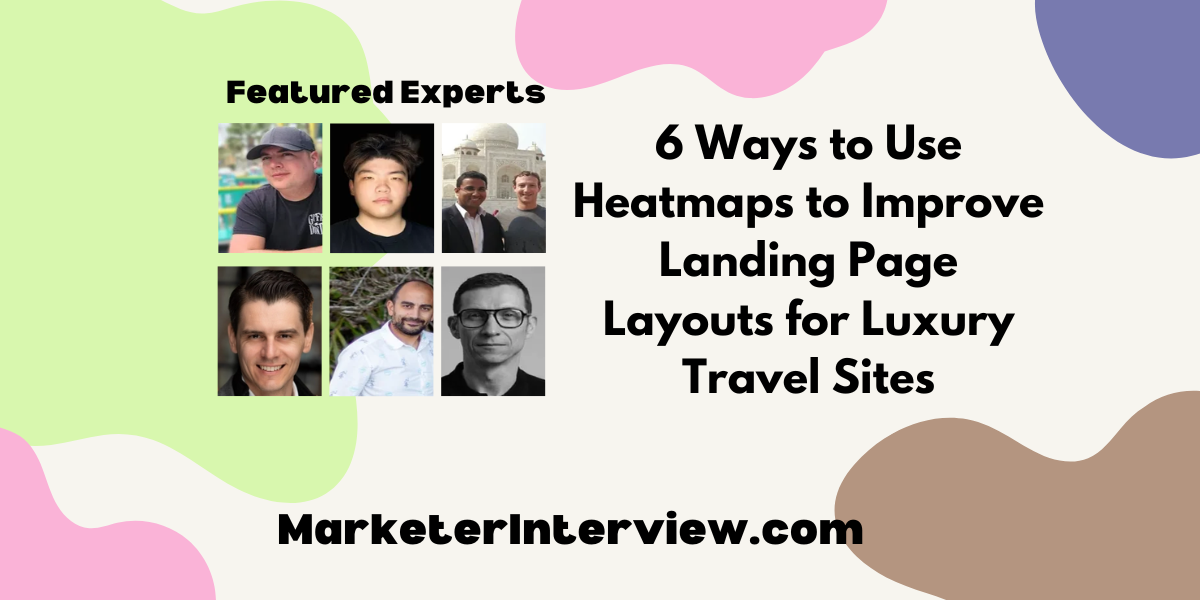
In the quest to perfect the art of luxury travel site design, we’ve gathered six expert tips from industry leaders including CEOs and Founders. From optimizing high engagement areas to employing scroll-tracking for element placement, discover how heatmaps can transform your landing page layouts.
Want to get quoted in MarketerInterview.com content just like this? Apply to become a contributor today!
Contents
Optimize High Engagement Areas
One specific tip for using heatmaps to enhance landing page layouts for luxury travel sites is to focus on identifying and optimizing areas with high engagement. By analyzing heatmap data, you can pinpoint exactly where visitors are clicking, lingering, or getting stuck. For instance, if you notice that users frequently click on non-interactive elements or repeatedly scroll through particular sections, it’s an opportunity to transform those areas into interactive, user-friendly features. This tailored approach ensures that your landing page not only captures the visitor’s attention but also guides them seamlessly toward making a booking or inquiry.

Peter Hamdy, Co-Founder and Managing Director, Auckland & Beyond Tours
Enhance Visual Appeal of Sections
I worked at Amazon for four years as a software engineer on the Amazon Fulfillment Technology team.
One effective technique for using heatmaps to improve landing page layouts for luxury travel sites is to analyze user interaction patterns to identify underperforming areas.
For instance, if a heatmap shows low engagement on a high-value section, consider repositioning it or enhancing its visual appeal to draw more attention and improve conversions.

Peter Wang, Founder, Exploding Insights
Address User Expectations with Interactivity
Heatmaps allow marketers and UI designers to leverage data rather than assumptions. Rage clicks—when a user clicks on a spot repeatedly within a page, expecting an action to happen—can negatively impact a user’s experience. By using a heatmap, you can address those issues with the design by better understanding what a user believes should be interactive. Then, it can either be made into an interactive element, like a link, or apply a different treatment to the design/layout to make it more clear that the section is not interactive.

Darren Fox, Entrepreneur & Marketing Director, DarrenFox.com
Place Content in Active Zones
In reply to the question on improving heatmaps for luxury travel sites’ landing page layouts, here is one tip that I am excited to share with you: It will help improve user experience and increase conversion rates.
One important technique is examining heatmap data closely to find out parts of intense customer engagement. A heatmap provides valuable insight into the behavior of users by showing where visitors are looking most, clicking, or scrolling.
For luxury travel sites, concentration should be put on displaying striking images and exciting write-ups in these active zones. These might include breathtaking destination photos, special offers, or immersive video content that captures the essence of luxury travel.
Heatmaps can also bring about potential pain points or areas of friction where users drop off or lose interest. By identifying these places, you can continuously refine your landing page layout, optimize CTA placements, and streamline the user journey for improved conversion rates.
In summary, luxury travel sites can leverage heatmap data to generate more visually appealing and user-friendly landing page designs. It is possible to effectively engage visitors and boost conversions in the competitive luxury travel industry by studying user interactions with websites and continuously improving them through heatmaps.
Best regards,
Mohd Rizwan

Mohd Rizwan, CEO, Travelosei
Identify Low Engagement for Layout Improvements
My recommendation is to use heatmaps to identify areas of low engagement/high bounce rates, as it will allow you to make data-driven decisions on how to improve the layout and design of your landing page for a more user-friendly experience. For luxury travel sites specifically, you may want to focus on elements such as high-quality images of luxurious destinations, clear call-to-action buttons for booking or requesting more information, and compelling, persuasive copy that highlights the unique luxury experience your site offers.

Tom Molnar, Operations Manager, Fit Design
Optimize Element Placement with Scroll-Tracking
One effective technique for improving landing page layouts for luxury travel sites is using scroll-tracking heatmaps. These heatmaps show how far down visitors scroll, revealing if important information or CTAs are being missed. With this information, you can optimize the placement of important elements to enhance user engagement.
Use heatmap insights to place “Book Now” buttons near areas where visitors spend more time, like attractive destination images. Ensure trip inclusions, pricing, and other important information are prominently displayed where users focus. Additionally, check if stunning visuals are grabbing attention and rearrange the layout or test different images if needed. Combining heatmaps with user testing and conversion analysis provides a complete picture, allowing you to showcase luxury travel experiences effectively and drive more bookings.

Shane McEvoy, MD, Flycast Media
Want to get quoted in MarketerInterview.com content just like this? Apply to become a contributor today!
